VyTA Farnese Bar / Collidanielarchitetto
Architects: Collidanielarchitetto
Area: 130 m²
Year: 2019
Photographs: Matteo Piazza
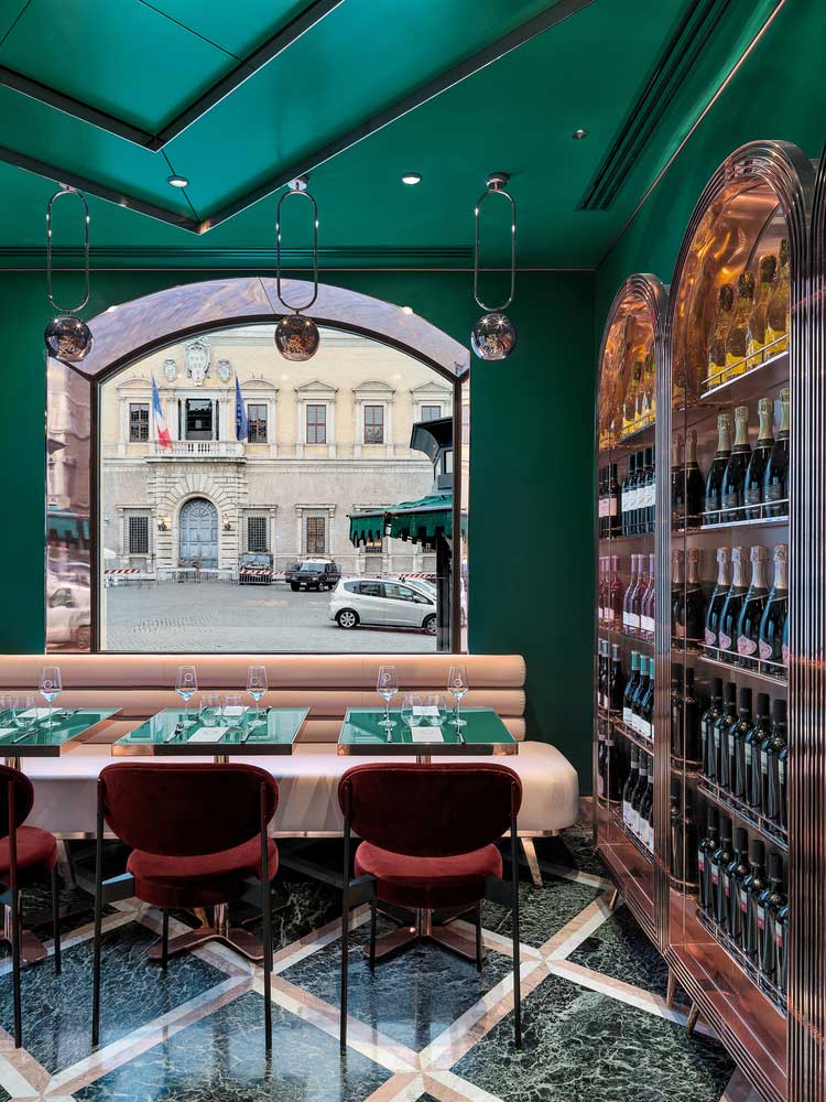
Text description provided by the architects. Overlooking Piazza Farnese, a stone’s throw from Campo de’ Fiori, one of Rome’s historic squares and the focal point of the capital’s nightlife, VyTA Farnese, created by interior design studio COLLIDANIELARCHITETTO combines the features of the traditional Italian bar and contemporary design. The project is an eclectic and experimental transformation of a timeless café: Caffè Farnese, a crossroads for illuminated minds and colourful characters, open from breakfast to post-dinner, where the window of the takeaway bar on Via Dei Baullari invites passers-by to uncurl and unwind.
Daniela Colli has created a space oozing with contemporary charm, fusing the refined elegance of the Renaissance period, European modernism and Millennial pink, with particular attention to detail and exquisite craftsmanship, which distinguishes the VyTA brand in its multiple spaces dedicated to hospitality, in Italy and London. Human experience is the main focus of the project. Interaction with customers is dynamic and guests are at the heart of the space, becoming an integral part of the scene, whether they’re perched at the cafeteria, consuming finger-food while sitting on Verpan marsala-coloured leather stools, or comfortably sipping a cocktail on a pink leather sofa.
“VyTA Farnese is an unexpected place, which, with its refined materials and decorations stimulates the interaction between people. In this challenging historical moment, where social distance is the springboard from which to regenerate our lives, this project, through the design of the takeaway bar overlooking the street, and set in one of the world’s most beautiful squares, presents a clever solution to hospitality which, as an inescapable expression of sociality, opens up the urban space of our cities”, says the architect.
VyTA Farnese was born from the dialogue between place and identity. The project fits into the historical context with refined materials such as polychrome marble, lacquered surfaces, mirrors and velvets, calibrated geometries and symmetries combined with bold shapes and a lively colour palette, from emerald green to Millennial pink with shiny copper accents. The windows on the street frame the interior, revealing a composition of playful textures and metaphysical arches with trompe-l’œil effects. The architecture draws inspiration from the Renaissance period in its use of elementary geometric shapes and for the articulation of the orthogonal and symmetrical plan, while the square and round arch give life to the original elements that characterize the interior design.
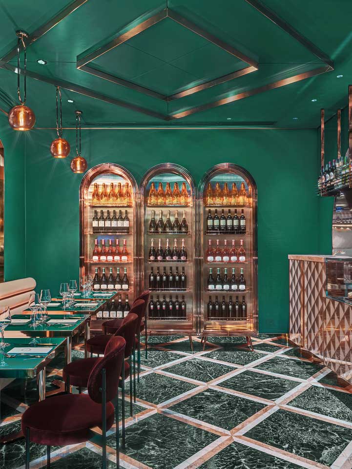
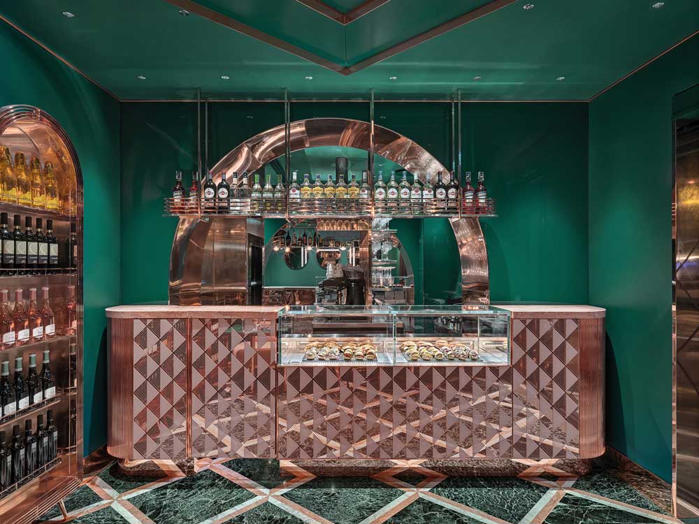
VyTA Farnese is developed on two levels: the ground floor houses the bar, the restaurant and the window of the takeaway bar, which allows customers to be served outdoors with piece of mind, and without having to access the premises. Three adjoining spans, connected to each other by large round arches covered in rose gold copper, create a delicate perspective game with increased depth. A bar counter with a central island shapes the matrix of the project: it is the hinge between the two rooms and embodies its intimate atmosphere, emerald green wallpaper and lacquered ceilings. In the corner room, a large arched opening frames the terrace facing Piazza Farnese and its fountain, creating continuity between inside and outside.
A heavily textured staircase in Alpi green marble, embellished with rose gold copper sphere appliques, leads to the lower level which houses the kitchen and utility rooms. The macroscale square generates the pattern of the hyper-realistic polychrome marble floor. In microscale, it becomes the evanescent decoration of the bar counter, where the overlap of pink mirror, transparent glass and sandblasted serigraphy creates a layer that dissolves, and at the same time amplifies its presence in space.
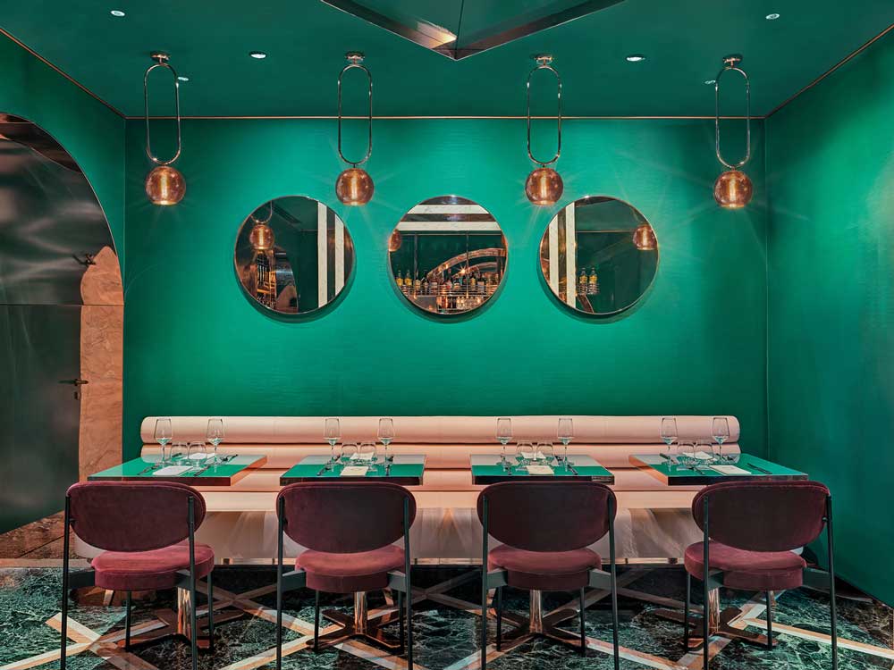
Circular mirrors fragment the reflected images through inserts in white marble, while globes in pink metallized glass illuminate small tables in emerald green glass, and a triptych of arches showcases the wines of the brand. VyTA Farnese redefines the concept of conviviality, giving the city a space that invites guests to breathe outdoors and that looks to the future of hospitality, without forgetting the great tradition of Italian bars and the ritual of coffee consumed standing at the counter as a welcome parenthesis in our bustling daily routines
توضیحات متنی ارائه شده توسط معماران. ویتا فارنس مشرف به پیاتزا فارنس، یکی از میدانهای تاریخی رم معروف به « پرتاب سنگ از کمپو د فیوری»، و کانون زندگی شبانۀ پایتخت، توسط استودیوی طراحی داخلی معماری کولیدانیل ساخته شده و در طراحی، ویژگیهای بارهای سنتی ایتالیایی و طراحی معاصر را ترکیب میکند. این پروژه تحولی انتخابی و تجربی از کافهای جاودانه است: کافه فارنس، محلی برای روشنفکران و شخصیتهای مختلف، از صبحانه تا بعد از شام، جایی که پنجرهی بار غذاخوری در ویا دی بائلری رهگذران را به عبور از پیچ و خم زندگی و تجربۀ آرامش دعوت میکند.
دانیلا کولی فضایی با جذابیت معاصر ایجاد کرده و با درهم آمیختن ظرافت دوره رنسانس، مدرنیسم اروپایی و برشی از هزارۀ تاریخ و با توجهی ویژه به جزئیات و صنایع دستی بدیع، نام ویتا را در فضاهای متعددی مخصوص پذیرایی مهمان در ایتالیا و لندن متمایز میکند. ایدۀ اصلی، طراحی تجربۀ انسانی است. تعاملی پویا با مشتریان داشته و مهمانان چه نشسته در کافهتریا، چه هنگام نشستن روی چهارپایههای چرمی رنگی ورپان مارسالا یا نوشیدن یک کوکتل روی مبل چرمی صورتی و یا حین خوردن فینگرفود ، در قلب فضای طراحی قرار داشته و به بخشی جداییناپذیر از صحنه تبدیل میشوند.
ویتا فارنس مکانی غیرمنتظره است که با مواد و تزئینات چشمنواز خود تعاملی بینظیر بین مردم ایجاد میکند. در این لحظۀ تاریخی چالشبرانگیز، که فاصلههای اجتماعی سکوی پرشی برای بازسازی زندگی ما است، این پروژه از طریق طراحی غذای آمادۀ بار مشرف به خیابان و در یکی از زیباترین میدانهای جهان، با ارائۀ راهحلی هوشمندانه برای مهماننوازی بهتر که اکنون امری اجتماعی گریزناپذیر است، فضای مسکونی شهرهای ما را نشان میدهد.»
ویتا فارنس از تعامل بین مکان و هویت متولد شد. این پروژه در بافت تاریخی با موادی ناب مانند سنگ مرمر پلیکروم، سطوح لاکی، آینهها و مخملها، با بهرهگیری از هندسه و تقارنهای دقیق بههمراه اشکال جسورانه و صفحات رنگی پرانرژی، از سبز زمردی تا صورتی هزاره با طیفهایی از مسی براق بهره میبرد. پنجرههایی رو به خیابان، فضای داخلی را شبیه به قاب عکس نشان داده و ترکیبی از بافتهای پرجنب و جوش و طاقهای متافیزیکی با جلوههای ترومپ لیل است. این معماری در استفاده از اشکال هندسی ابتدایی و برای بیان این پلانهای متعامد و متقارن از دورۀ رنسانس الهام میگیرد و با داشتن طاقهای مربع و گرد، به عناصر اصلی که مشخصۀ طراحی داخلی هستند، جان میبخشد.
ویتا فارنس در دو طبقه طراحی شده: طبقۀ همکف بار، رستوران و پنجرۀ بار غذای آماده که به مشتریان اجازه این امکان را میدهد تا با خیال راحت و بدون نیاز به دسترسی به داخل رستوران، غذایشان را در فضای باز میل کنند. سه دهانۀ مجاور که توسط طاقهای گرد و بزرگ پوشیده شده از مس رزگلد بههم متصل شده و با افزایش عمق بصری یک بازی دیداری سهبعدی ظریف ایجاد میکنند. پیشخوان بار با قسمت مجزای مرکزی، بخش اصلی پروژه را شکل داده و محل اتصال بین دو اتاق است؛ فضای گرم، کاغذ دیواری سبز زمردی و سقفهای لاکی آن تجسّم زیبایی بار است. در اتاق گوشه، دهانۀ قوسی بزرگی بالکن رو به پیاتزا فارنزه و فواره آنرا مانند قاب عکسی نشان داده و تعاملی پیوسته بین فضای داخلی و خیابان ایجاد میکند.
پلکانی با بافت سنگین از سنگ مرمر سبز آلپی که با رزگلد مسی تزئین شده، به طبقۀ پایینی که آشپزخانه و اتاق لوازم را در خود جای داده ختم میشود. الگوی کف مرمری با کرومهای فرا واقعی، مربعی بزرگ است. در مقیاس کوچکتر، تزیین ناپیدای میلۀ پیشخوان، که همپوشانی آینۀ صورتی، شیشۀ شفاف و سندبلاست لایهای محو ایجاد میکند و همزمان حس حضور در آن فضا را پررنگتر میکند.
آینههای گرد تصاویر انعکاسی فضا را از طریق تکههای سنگ مرمر سفید میشکنند، و کرههای شیشهای فلزی صورتی، میزهای کوچک شیشهای سبز زمرّدی را روشن کرده، شرابهای این نام تجاری در سه محفظۀ قوسیشکل نمایان میشود. ویتا فارنس مفهوم شادی و نشاط را ملموستر کرده و با ایجاد فضایی برای تنفّس در فضای آزاد به مهمانان، روشی نوین در مهماننوازی فراهم میکند. ما در شلوغی کارهای روزمرهمان، بدون فراموش کردن سنّت کهن بارهای ایتالیایی و آیین صرف ایستادۀ قهوه روی پیشخوان، به میهمانان خوشآمد میگوییم.